R.J. REYNOLDS 150
To mark 150 years of R.J. Reynolds, we developed an identity that felt like a championing of North Carolina heritage, instead of just a corporate anniversary.
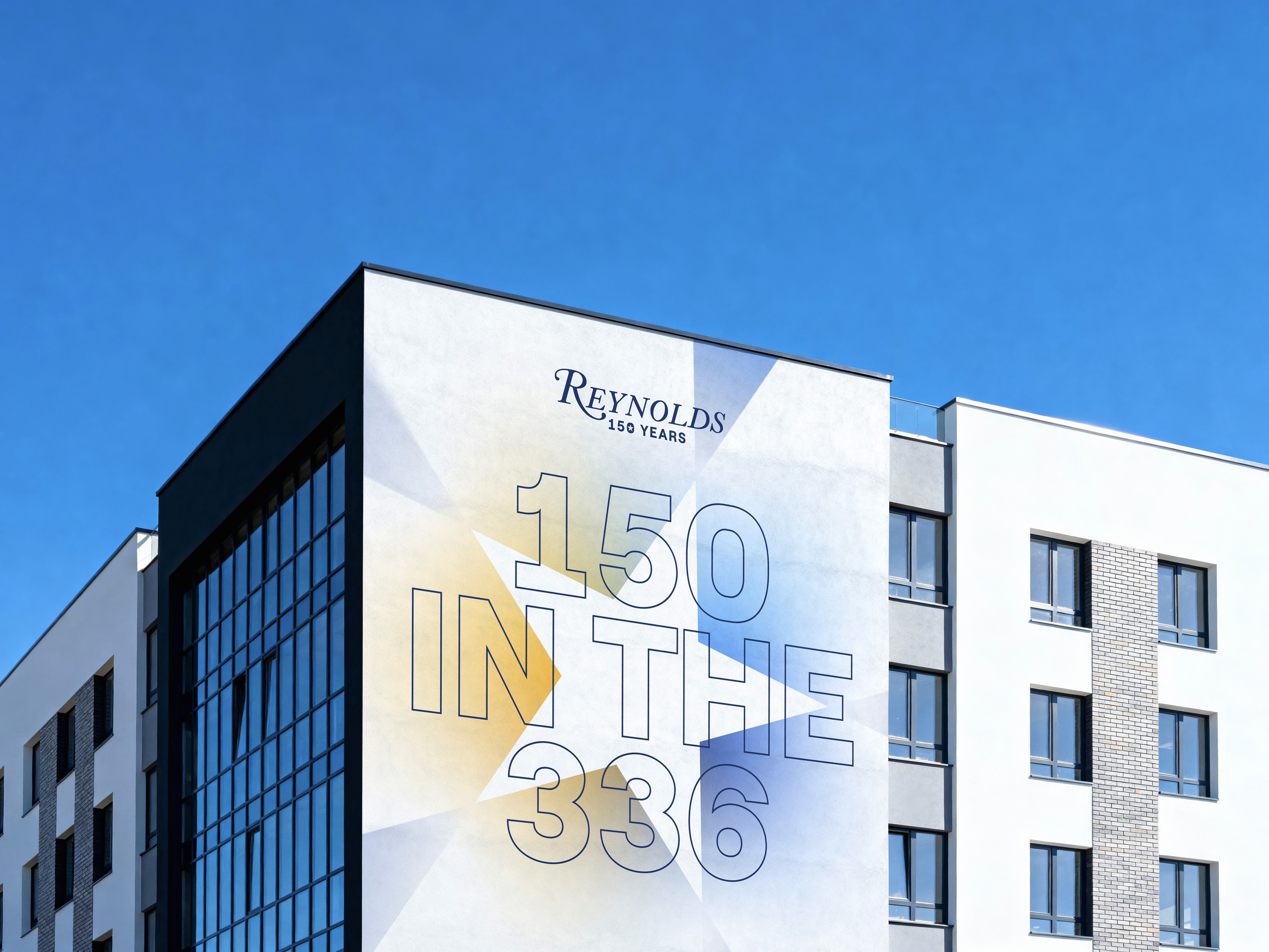
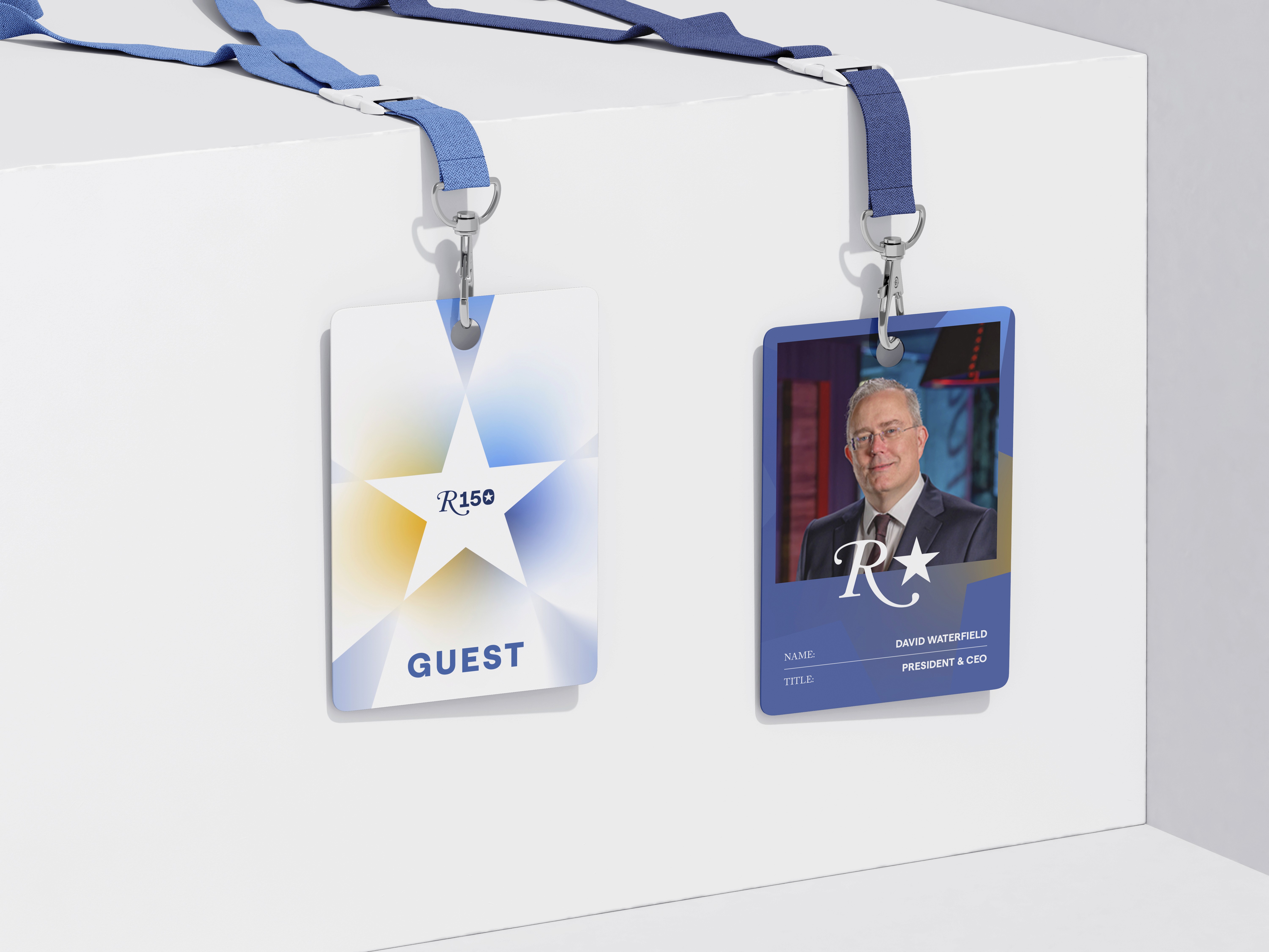
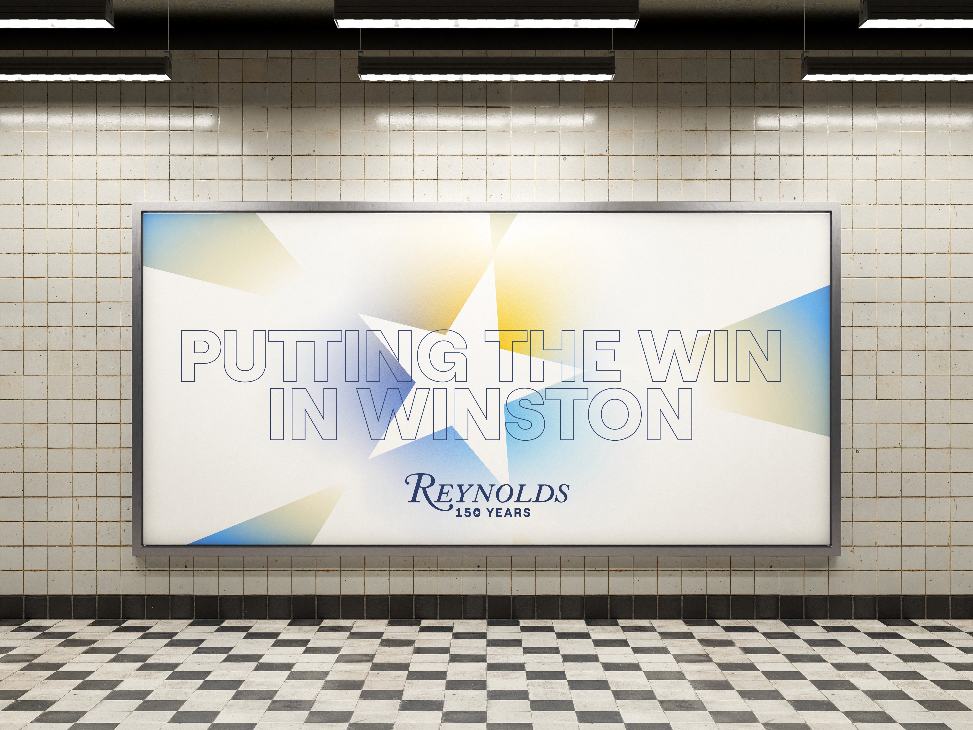
By building the visual system around the iconic star of the state flag, we created a connection with the local community, that also gave a sense of celebration.
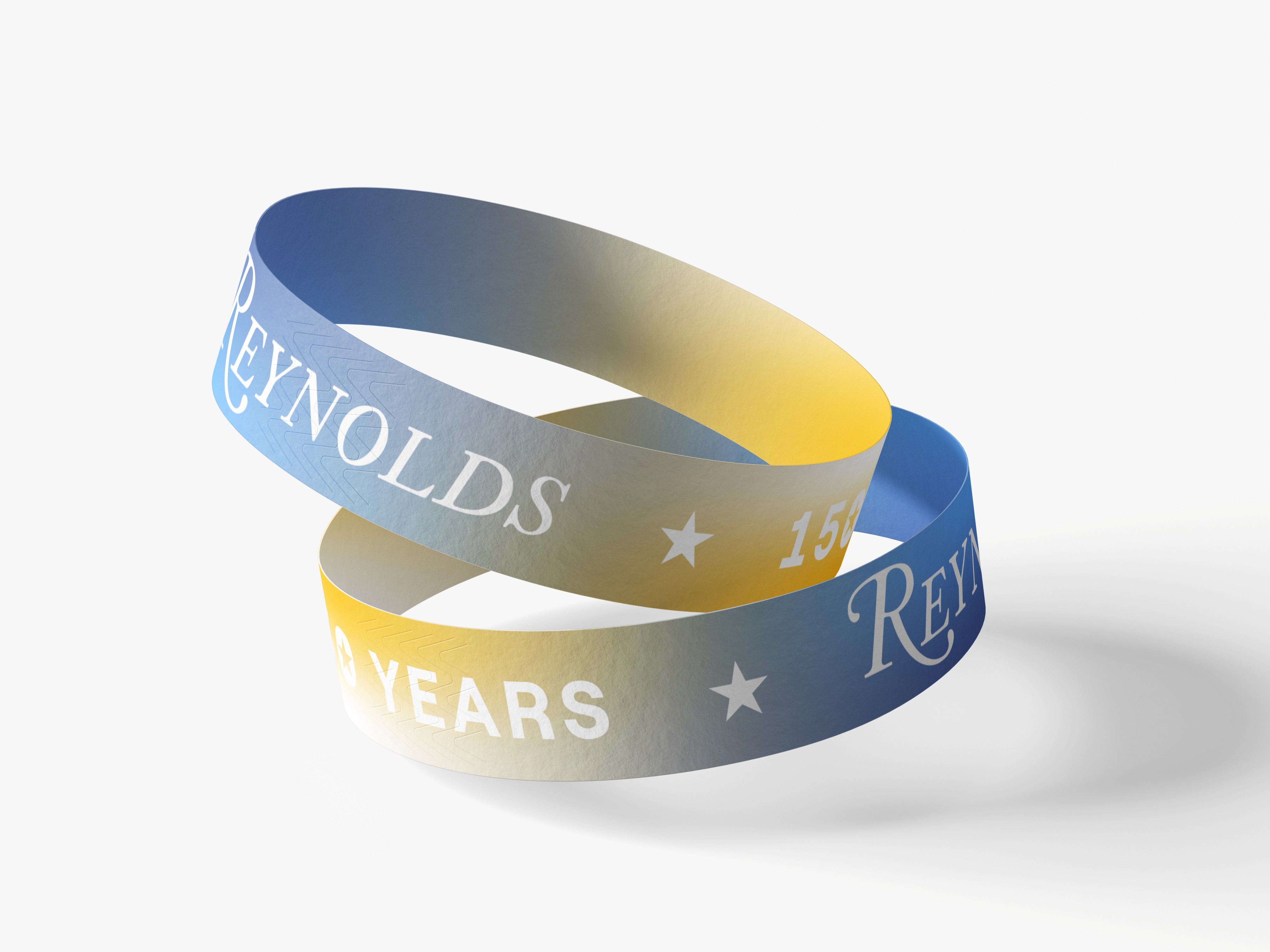
We used expressive, localised copy and gradients to build a modular system that lived everywhere; shining brightly from print collateral to massive building wraps. This flexible approach ensured the brand’s voice remained cohesive and inviting throughout a year-long program of community events.
Ultimately, the identity became a symbol of regional pride rather than just a milestone for a global business. It strengthened the bond between an international company and the people who make it what it is.